Color comparison guide
Burgundy vs Maroon: Color Differences & HEX Codes
For these swatches, burgundy (#800020) has a red-purple cast, while maroon (#800000) is a dark red. Maroon is a defined CSS keyword. Burgundy has no CSS keyword or single universal HEX value; #800020 is the digital reference chosen for this comparison.
By Color Match · Updated
Burgundy
#800020
A selected digital burgundy reference, not a CSS keyword or universal material standard.
Explore #800020Values and text contrast
| Property | Burgundy | Maroon |
|---|---|---|
| HEX | #800020 | #800000 |
| RGB | 128, 0, 32 | 128, 0, 0 |
| HSL | 345°, 100%, 25% | 0°, 100%, 25% |
| Against white | 10.832:1Normal text: AAA | 10.950:1Normal text: AAA |
| Against black | 1.939:1Normal text: Fail | 1.918:1Normal text: Fail |
Values use opaque sRGB colors. HSL is rounded for display and is not a perceptual color-difference score. Contrast classifications use the unrounded WCAG ratio.
Burgundy and Maroon as text and background
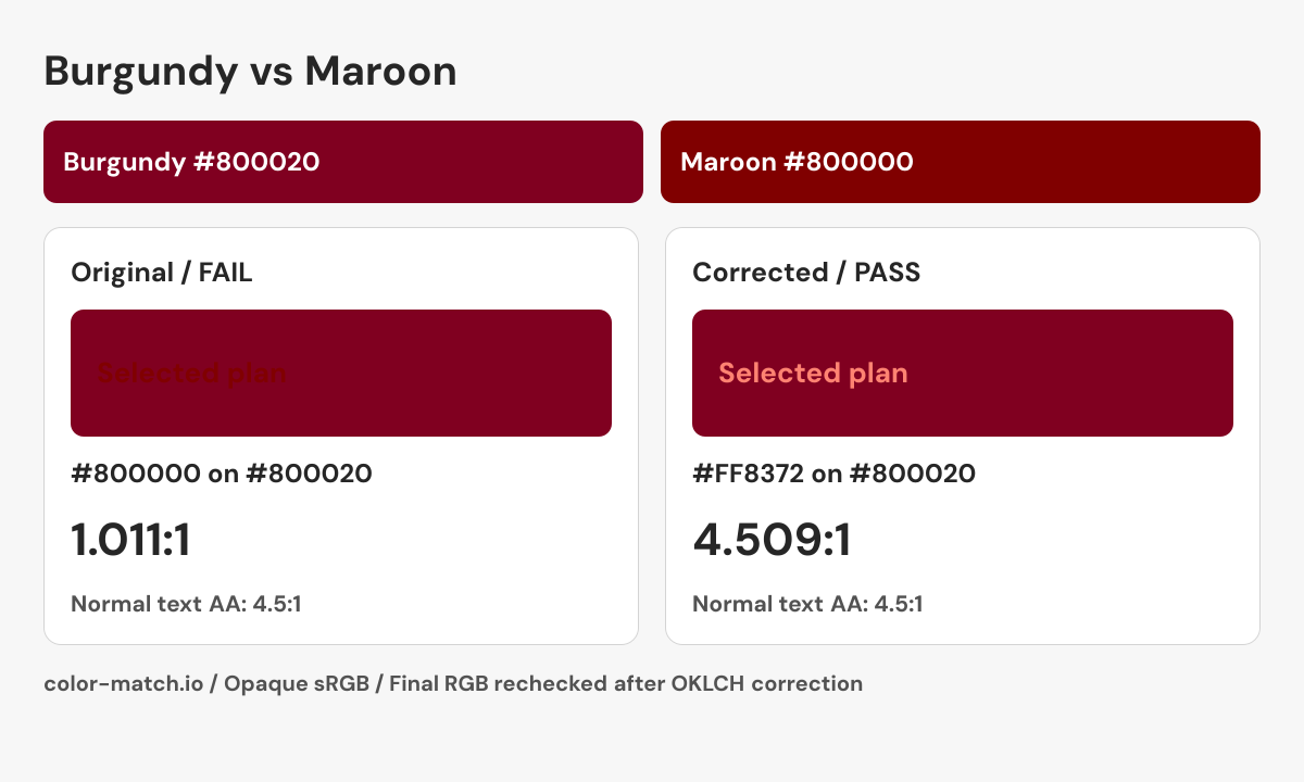
Pair contrast: 1.011:1. Normal text: Fail. Large text: Fail.
WCAG AA requires 4.5:1 for normal text and 3:1 for large text; AAA requires 7:1 and 4.5:1 respectively. Large text is at least 18 pt (24 CSS px), or 14 pt (about 18.67 CSS px) when bold. These checks cover text contrast, not complete accessibility.
A selected plan inside a burgundy card
A pricing card uses the selected burgundy reference as its surface. The 16 px “Selected plan” text must remain readable inside the card; another dark red is not enough.
1.011:1 — Fail normal text AA
The close luminance makes this text arrangement fail even though the RGB values differ.
Check #800000 on #80002010.832:1 — Pass normal text AA
White is a practical replacement when retaining a red label is unnecessary.
Check #FFFFFF on #800020Keep burgundy as the card surface and use white for a straightforward label. If the design needs a tinted label, the lighter maroon-derived candidate below passes the same text check. Do not use a burgundy-to-maroon fill change as the only indication of a selected plan.
A correction you can reproduce
Change the foreground while keeping the background fixed. The OKLCH search returns a nearby passing candidate, then measures the final six-digit sRGB colors again. It does not guarantee the mathematically nearest color.
- Original pair
- #800000 on #800020
- 1.011:1 — Fail normal text AA
- Corrected pair
- #FF8372 on #800020
- 4.509:1 — Pass normal text AA
.example-label {
  color: #FF8372;
  background-color: #800020;
}
This snippet contains the checked color pair. Apply the non-color checks below when building the real component.

Checks beyond the color pair
- Display the words “Selected plan” and a checkmark beside the option.
- Expose selection through the appropriate native radio control or aria-pressed button state.
- Keep plan names and prices available as text, including in high-contrast modes.
What creates the difference?
The two examples share a red value of 128 and a green value of zero. Burgundy adds 32 units in the blue channel, moving its hue toward purple. They have the same HSL lightness, but that does not make their relative luminance identical: HSL lightness and WCAG luminance are different calculations. Read the contrast table for the actual text relationship instead of inferring it from the names or a single HSL number.
Choosing between them for a design
Place each reference beside the same cream, gray, or white surface before choosing an accent. Burgundy introduces a purple direction that can connect to mauve or plum elements; maroon keeps the accent closer to the red axis. Treat those as compositional options rather than promises about how an audience will feel. For a logo or established brand, the supplied master color value takes precedence over either reference shown here.
Can burgundy and maroon work together?
They can appear in decorative layers, but these two dark references are close in luminance. Their side-by-side appearance should not be mistaken for a readable text/background pair. A maroon link on burgundy, or the reverse, needs the explicit contrast check shown here. For adjacent chart categories, retain text labels or distinct markers. If the project involves clothing, ink, or wall paint, compare physical samples because the names do not identify a single pigment or production formula.
Sources and calculation method
CSS keyword values follow the W3C named-color table. A reference described as selected is an editorial swatch. Contrast is calculated from these exact values using WCAG relative luminance.