Color comparison guide
Navy Blue vs Royal Blue: Differences & HEX Codes
Using CSS references, navy blue (#000080) is a very dark blue and royal blue (#4169E1) is a lighter, brighter blue. Both belong to the blue family, but they produce different text contrast and visual emphasis. The CSS keywords are navy and royalblue.
By Color Match · Updated
Navy blue
#000080
The exact value of CSS navy; navyblue is not a CSS named-color keyword.
Explore #000080Values and text contrast
| Property | Navy blue | Royal blue |
|---|---|---|
| HEX | #000080 | #4169E1 |
| RGB | 0, 0, 128 | 65, 105, 225 |
| HSL | 240°, 100%, 25% | 225°, 73%, 57% |
| Against white | 16.010:1Normal text: AAA | 4.847:1Normal text: AA |
| Against black | 1.312:1Normal text: Fail | 4.333:1Normal text: Fail |
Values use opaque sRGB colors. HSL is rounded for display and is not a perceptual color-difference score. Contrast classifications use the unrounded WCAG ratio.
Navy blue and Royal blue as text and background
Pair contrast: 3.303:1. Normal text: Fail. Large text: AA.
WCAG AA requires 4.5:1 for normal text and 3:1 for large text; AAA requires 7:1 and 4.5:1 respectively. Large text is at least 18 pt (24 CSS px), or 14 pt (about 18.67 CSS px) when bold. These checks cover text contrast, not complete accessibility.
A link on a navy navigation panel
Royal blue can work as a link on a white page, but moving that same 16 px link to a navy panel changes the background and its contrast result.
4.847:1 — Pass normal text AA
This check describes the light page only.
Check #4169E1 on #FFFFFF3.303:1 — Fail normal text AA
The dark navigation surface needs a lighter link color.
Check #4169E1 on #000080Retain navy for the panel and use the lighter royal-blue-derived link below. Underline it in its default state so it is recognizable alongside body text. A passing link-to-background ratio alone does not check whether a link is distinguishable from surrounding text.
A correction you can reproduce
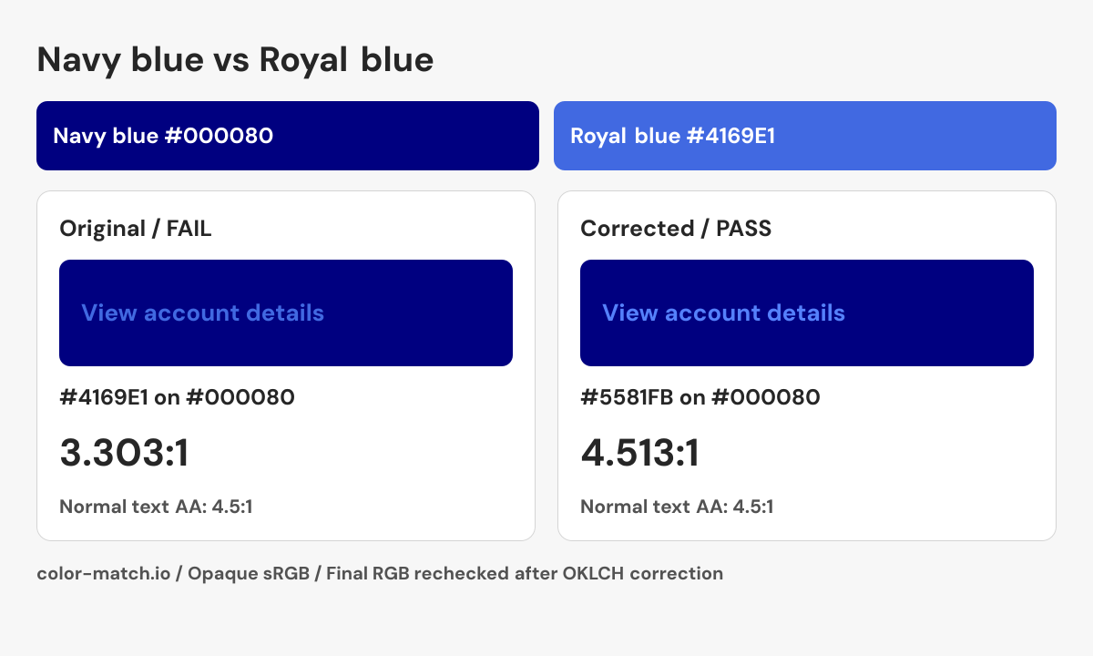
Change the foreground while keeping the background fixed. The OKLCH search returns a nearby passing candidate, then measures the final six-digit sRGB colors again. It does not guarantee the mathematically nearest color.
- Original pair
- #4169E1 on #000080
- 3.303:1 — Fail normal text AA
- Corrected pair
- #5581FB on #000080
- 4.513:1 — Pass normal text AA
.example-label {
  color: #5581FB;
  background-color: #000080;
}
This snippet contains the checked color pair. Apply the non-color checks below when building the real component.

Checks beyond the color pair
- Keep a persistent underline on links within paragraphs.
- Add a visible focus treatment for keyboard navigation.
- Check visited and hover text colors against navy independently.
Check this navy-panel link against both body text and background.
Their hue and brightness differ
Navy contains only the blue RGB channel in this reference. Royal blue adds red and green while raising the blue channel, producing a lighter color with a hue slightly toward cyan relative to navy. Navy has the higher HSL saturation despite appearing much darker. Saturation describes the color model, so a higher percentage does not necessarily mean a color will look brighter or attract more attention in a layout.
Using navy for structure and royal blue for accents
A useful starting point is navy for a heading or navigation surface and royal blue for an action accent. Preview both on your actual background: royal blue as a button fill and royal blue as small link text are separate decisions. Underline inline links so their meaning does not depend only on blue. When navy is a page background, test the royal-blue accent against navy as well as testing any label inside that accent.
Do the two blues provide enough contrast?
Two recognizable blues can still fail as normal-size text on each other. Use the calculated pair ratio shown here to evaluate that arrangement; the separate white and black columns answer different questions. Hover, focus, and disabled states may introduce additional colors that need their own checks. Clothing, uniforms, and printed brand guides may use other navy or royal-blue references. Preserve the supplied numerical values and request a proof when a physical color match matters.
Sources and calculation method
CSS keyword values follow the W3C named-color table. A reference described as selected is an editorial swatch. Contrast is calculated from these exact values using WCAG relative luminance.