Color comparison guide
Gray vs Grey: Spelling, CSS Values & Color Codes
Gray and grey are spelling variants, not different colors. Gray is the usual US spelling and grey is common in UK English. In CSS, both keywords are defined as #808080, or rgb(128, 128, 128), so switching between them produces no color difference.
By Color Match · Updated
Values and text contrast
| Property | Gray | Grey |
|---|---|---|
| HEX | #808080 | #808080 |
| RGB | 128, 128, 128 | 128, 128, 128 |
| HSL | 0°, 0%, 50% | 0°, 0%, 50% |
| Against white | 3.949:1Normal text: Fail | 3.949:1Normal text: Fail |
| Against black | 5.317:1Normal text: AA | 5.317:1Normal text: AA |
Values use opaque sRGB colors. HSL is rounded for display and is not a perceptual color-difference score. Contrast classifications use the unrounded WCAG ratio.
Gray and Grey as text and background
Pair contrast: 1.000:1. Normal text: Fail. Large text: Fail.
These are identical colors. Text in one on a background of the other is invisible at full opacity, with a contrast ratio of 1:1.
WCAG AA requires 4.5:1 for normal text and 3:1 for large text; AAA requires 7:1 and 4.5:1 respectively. Large text is at least 18 pt (24 CSS px), or 14 pt (about 18.67 CSS px) when bold. These checks cover text contrast, not complete accessibility.
A small secondary label on a white settings page
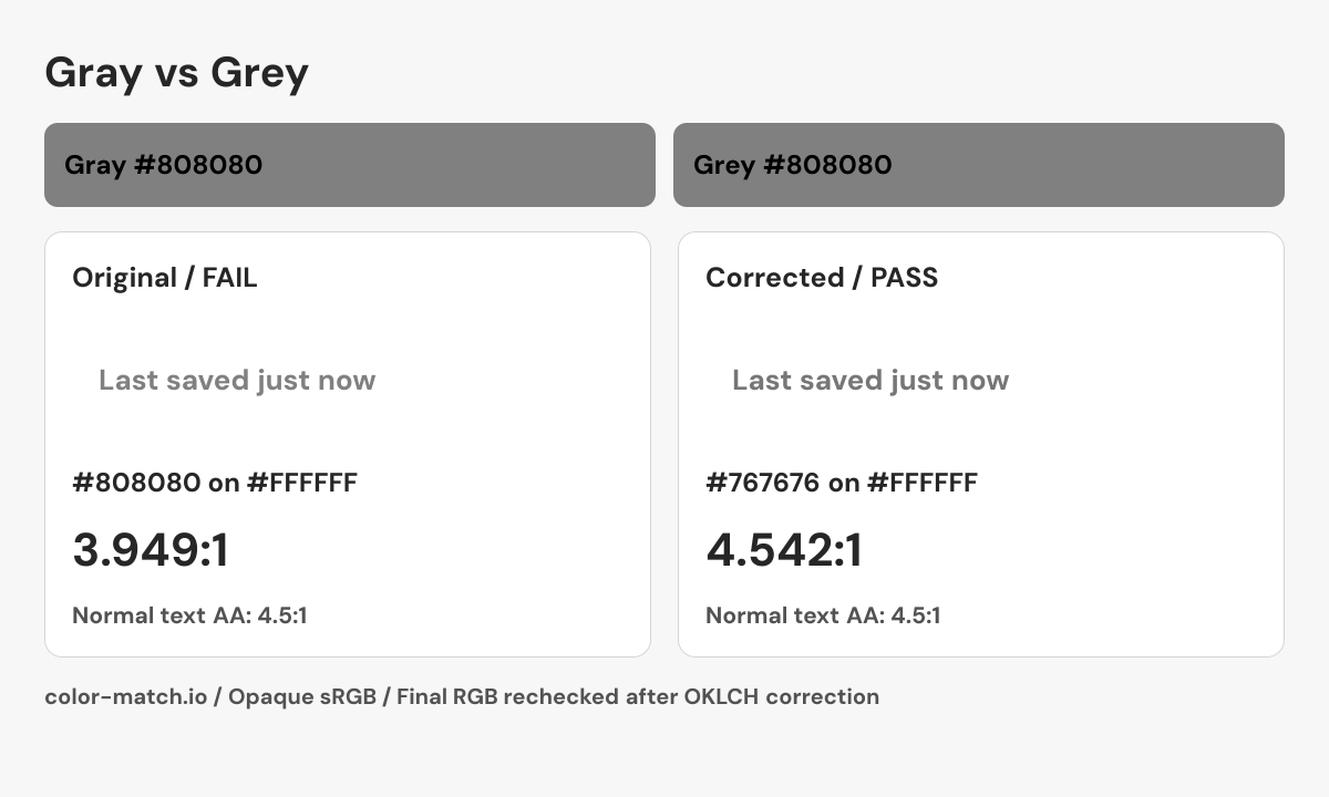
A settings page uses 14 px gray text for “Last saved just now”. Switching the CSS spelling to grey preserves #808080 and cannot repair its contrast on white.
3.949:1 — Fail normal text AA
A neutral appearance does not exempt secondary text from the normal-text check.
Check #808080 on #FFFFFF3.949:1 — Fail normal text AA
The identical alias has exactly the same failing ratio.
Check #808080 on #FFFFFFUse the darker neutral below for the small saved-status label and document it as a semantic secondary-text token. Both original spellings remain #808080. Do not mark informative text as disabled just to avoid checking its readability.
A correction you can reproduce
Change the foreground while keeping the background fixed. The OKLCH search returns a nearby passing candidate, then measures the final six-digit sRGB colors again. It does not guarantee the mathematically nearest color.
- Original pair
- #808080 on #FFFFFF
- 3.949:1 — Fail normal text AA
- Corrected pair
- #767676 on #FFFFFF
- 4.542:1 — Pass normal text AA
.example-label {
  color: #767676;
  background-color: #FFFFFF;
}
This snippet contains the checked color pair. Apply the non-color checks below when building the real component.

Checks beyond the color pair
- Keep the status message in text; a gray dot alone does not convey “saved”.
- Use an appropriate live region if save status changes without moving focus.
- Keep secondary information readable when zoomed, reflowed or shown in high-contrast mode.
Choosing a spelling in a color system
Use the spelling that suits your audience or existing codebase, and keep the exported token names consistent. Both CSS keywords are valid, but a custom property such as --gray-500 is a name you define: --grey-500 will be a separate property unless you explicitly connect them. This distinction matters when copying a palette between projects. Changing a human-readable label does not automatically rename the variables used by the stylesheet.
Gray, dark gray, and light gray in CSS
The named-color set has historical inconsistencies. CSS darkgray and darkgrey are #A9A9A9, which is actually lighter than gray and grey at #808080. CSS lightgray and lightgrey are lighter again at #D3D3D3. Do not sort these keywords by the words alone when building a neutral scale. Inspect their actual channel values and contrast. A numeric token scale can help document your own intended progression without relying on these names.
Using gray text without losing readability
Gray and grey on each other have a 1:1 contrast ratio, so neither can make a visible label on the other. The white and black comparisons shown here show why a neutral is not automatically a safe text color on every surface. Check small secondary labels as carefully as the main body text. In photography, paint, and interiors, gray can describe many lighter, darker, warmer, or cooler samples; a spelling choice does not specify any of those differences.
Sources and calculation method
CSS keyword values follow the W3C named-color table. A reference described as selected is an editorial swatch. Contrast is calculated from these exact values using WCAG relative luminance.