Color comparison guide
Teal vs Turquoise: Color Differences & HEX Codes
Teal and turquoise both sit in the blue-green range. For the CSS colors compared here, teal (#008080) is darker, while turquoise (#40E0D0) is lighter and slightly greener by HSL hue. These exact values make the comparison reproducible; everyday uses of the names cover a wider range of shades.
By Color Match · Updated
Turquoise
#40E0D0
The exact value of the CSS turquoise keyword. It differs from the #30D5C8 general turquoise reference also found in color guides.
Explore #40E0D0Values and text contrast
| Property | Teal | Turquoise |
|---|---|---|
| HEX | #008080 | #40E0D0 |
| RGB | 0, 128, 128 | 64, 224, 208 |
| HSL | 180°, 100%, 25% | 174°, 72%, 56% |
| Against white | 4.773:1Normal text: AA | 1.642:1Normal text: Fail |
| Against black | 4.399:1Normal text: Fail | 12.791:1Normal text: AAA |
Values use opaque sRGB colors. HSL is rounded for display and is not a perceptual color-difference score. Contrast classifications use the unrounded WCAG ratio.
Teal and Turquoise as text and background
Pair contrast: 2.907:1. Normal text: Fail. Large text: Fail.
WCAG AA requires 4.5:1 for normal text and 3:1 for large text; AAA requires 7:1 and 4.5:1 respectively. Large text is at least 18 pt (24 CSS px), or 14 pt (about 18.67 CSS px) when bold. These checks cover text contrast, not complete accessibility.
A white label on a booking button
A booking page uses a 16 px white “Reserve a table” label. Compare the two named colors as the button fill, while holding the label constant.
4.773:1 — Pass normal text AA
The CSS teal fill works with this normal-size white label.
Check #FFFFFF on #0080801.642:1 — Fail normal text AA
The lighter CSS turquoise fill needs a different label color or a darker fill.
Check #FFFFFF on #40E0D0If the white label is part of the button system, use teal or the darker turquoise-derived fill below. The correction is a new color, not the CSS turquoise keyword. Keeping the original turquoise is also possible with a dark label; check the button boundary separately.
A correction you can reproduce
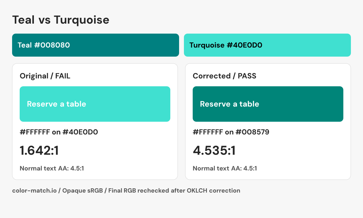
Change the background while keeping the foreground fixed. The OKLCH search returns a nearby passing candidate, then measures the final six-digit sRGB colors again. It does not guarantee the mathematically nearest color.
- Original pair
- #FFFFFF on #40E0D0
- 1.642:1 — Fail normal text AA
- Corrected pair
- #FFFFFF on #008579
- 4.535:1 — Pass normal text AA
.example-label {
  color: #FFFFFF;
  background-color: #008579;
}
This snippet contains the checked color pair. Apply the non-color checks below when building the real component.

Checks beyond the color pair
- Use an actual button element for the booking action.
- Provide a visible keyboard focus indicator and check it against the surrounding surface.
- Keep the action label present during loading; communicate progress with text as well as animation.
Which is darker, teal or turquoise?
With these reference values, teal has the lower relative luminance and HSL lightness. That makes the difference especially clear beside white. The RGB channels explain the relationship: teal has equal green and blue channels, while CSS turquoise has a little more green than blue and a higher red channel. This is a comparison of two specified sRGB colors, not a rule that every paint or fabric called teal must be darker than every product called turquoise.
Using teal and turquoise in a palette
Try teal for a compact action surface and turquoise for a larger accent area, then inspect the labels on each independently. A dark teal and a light turquoise can establish hierarchy within one hue family, but their difference alone may be insufficient for a selected state or chart legend. Add a label, marker, or shape where the distinction carries information. The contrast results above let you check each proposed text relationship before exporting the colors.
Why turquoise HEX codes disagree
Some references use #30D5C8 for turquoise; the CSS keyword uses #40E0D0. Those are different swatches, so a comparison using the other reference will produce different values. If you are reproducing a supplied design, keep its exact HEX rather than substituting the CSS keyword by name. For physical materials, compare actual samples under the intended lighting; a screen swatch cannot establish a paint or textile match.
Sources and calculation method
CSS keyword values follow the W3C named-color table. A reference described as selected is an editorial swatch. Contrast is calculated from these exact values using WCAG relative luminance.