Skip to content

Curated color combinations

Dark Mode Color Palettes with HEX Codes

A dark mode color palette combines a dark surface, a light reading color and accents chosen for that background. Reassign colors by role rather than simply inverting a light theme. These three examples provide a main surface, a supporting dark swatch and a tested light text pair, with the accent label checked separately.

Curated by Color Match · Updated · Calculated contrast from the displayed HEX values

Navy and glacier

Use deep navy for the page and light gray for reading. Glacier blue fills the main action, while the second dark swatch can distinguish a card or sidebar. Mint is a supporting accent for illustrations; if it communicates success, add a text label or icon and verify the actual state component independently.

Palette preview

Make room for your ideas.

Reading text uses #E5E7EB on a #111827 surface.

Edit this palette

Reading text: #E5E7EB on #111827
14.328:1 — Pass normal text AA

Accent label: #000000 on #93C5FD
11.645:1 — Pass normal text AA

The label adds black or white, whichever has higher contrast on the accent.

Charcoal and amber

Warm off-white text softens the visual temperature of a charcoal surface. Amber gives the main action a clear focal point, while sage supports smaller decorative areas. For a media or reading interface, preview a full paragraph alongside artwork: do not assume that passing the text ratio settles image brightness or the visibility of player controls.

Palette preview

Make room for your ideas.

Reading text uses #F2EDE4 on a #191919 surface.

Edit this palette

Reading text: #F2EDE4 on #191919
15.078:1 — Pass normal text AA

Accent label: #000000 on #F2BE63
12.321:1 — Pass normal text AA

The label adds black or white, whichever has higher contrast on the accent.
Plum and lavender

A dark plum surface and pale lilac text create a purple-led theme without placing saturated purple behind long passages. Lavender fills the action and rose provides an optional secondary highlight. Use the lighter plum swatch for supporting panels, then recheck any text moved onto it; the main surface result only describes the pair shown here.

Palette preview

Make room for your ideas.

Reading text uses #F0EAF6 on a #211B2D surface.

Edit this palette

Reading text: #F0EAF6 on #211B2D
14.138:1 — Pass normal text AA

Accent label: #000000 on #C4A7E7
10.029:1 — Pass normal text AA

The label adds black or white, whichever has higher contrast on the accent.

Worked UI example

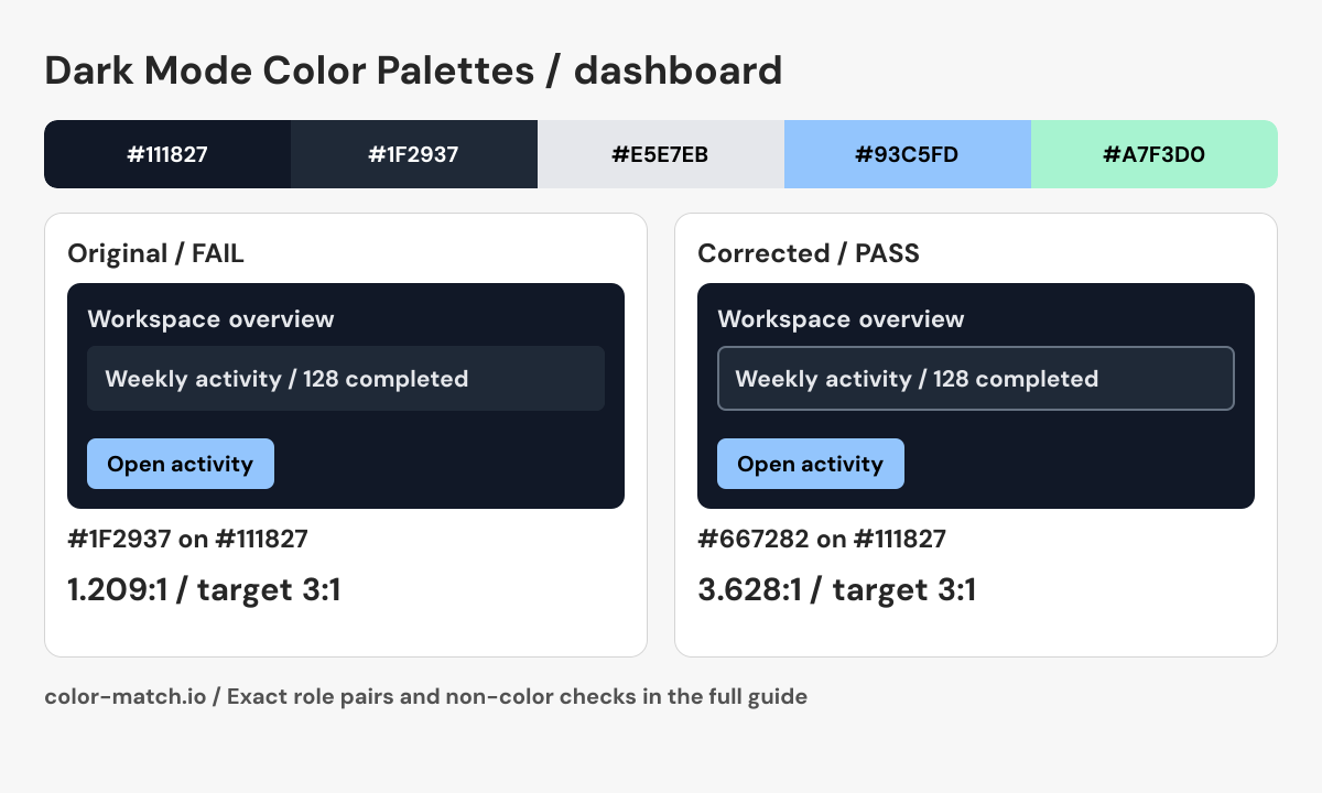
Dark dashboard: a card edge that remains visible on navy

A dashboard uses “Navy and glacier”. The elevated #1F2937 card is close to the #111827 page in luminance. When an outline is needed to identify an interactive card, the fill difference alone is insufficient.

The original problem

Card boundary against navy page: #1F2937 on #111827

1.209:1 — Fail at 3:1

This example treats the boundary as necessary to identify a control. Ordinary decorative card edges have no blanket 3:1 requirement.

Retain the two dark surfaces and add the lighter blue-gray outline below. It is computed against the card fill, the harder of its two adjacent surfaces, then checked against the outer navy page as well. This does not establish that the outline is a sufficient keyboard focus indicator.

Corrected pair: #667282 on #1118273.628:1, Pass at 3:1.

Corrected dashboard preview

Before using this in a real interface

  • Write “All services operational” beside any status marker.
  • Make the card action keyboard reachable with a visible focus indicator.
  • Label chart series directly and include values or a data table so hue is not the only carrier of information.

This is a static role preview. These measurements cover the listed opaque color pairs; layout, keyboard behavior, focus, transparent layers and additional states need their own checks.

Edit the original five-color palette
Final role pairs, measured after correction
Role relationshipForeground / backgroundContrastResult
Reading text / page#E5E7EB / #11182714.328:1Pass at 4.5:1
Reading text / component#E5E7EB / #1F293711.856:1Pass at 4.5:1
Action label / action fill#000000 / #93C5FD11.645:1Pass at 4.5:1
Boundary / outside surface#667282 / #1118273.628:1Pass at 3:1
Boundary / inside surface#667282 / #1F29373.002:1Pass at 3:1

Text rows use normal-text AA at 4.5:1. Necessary control boundaries use 3:1 against the named adjacent surface. Decisions use unrounded ratios. The correction uses the same OKLCH candidate search as the contrast checker; clipping and integer RGB conversion can change the final hue or chroma.

Use the checked roles in CSS
.example {
  --surface: #111827;
  --component: #1F2937;
  --text: #E5E7EB;
  --secondary-text: #E5E7EB;
  --action: #93C5FD;
  --action-text: #000000;
  --boundary: #667282;
  color: var(--text);
  background: var(--surface);
}
.example .component {
  color: var(--text);
  background: var(--component);
  border: 2px solid var(--boundary);
}
.example .secondary { color: var(--secondary-text); }
.example .action {
  color: var(--action-text);
  background: var(--action);
}

These roles include the calculated correction. Apply the selectors to your semantic HTML and complete the non-color checks above.

Dark dashboard: a card edge that remains visible on navy. The corrected #667282 on #111827 pair measures 3.628:1; every final role pair is listed in the table above.
Original Color Match role diagram showing the source palette, corrected component and checked boundary or label. Download PNG.

For inline links, check the accent against both body text and the page surface. A button fill is not automatically a passing link color.

How to use this collection

  • Check each elevated card against its own text and controls; a pass on the page background does not transfer automatically.
  • Reserve brighter accents for a small number of actions. Use spacing and headings to organize the rest of the screen.
  • Check focus rings, hover states, charts and images in the complete dark interface before shipping the theme.

Color values and contrast method

Six-digit HEX codes specify opaque sRGB colors. Contrast results use WCAG relative luminance; pass or fail uses the unrounded ratio and the normal-text AA threshold of 4.5:1. A passing reading pair does not certify an entire palette or interface. Recheck transparent layers, other surfaces and component states in their actual context.

W3C: Contrast (Minimum) · W3C: CSS hexadecimal color notation · Our calculation methods

W3C: Non-text Contrast · Reproduce the contrast validation cases