Skip to content

Curated color combinations

Earth Tone Color Palettes with HEX Codes

An earth tone color palette uses colors reminiscent of soil, clay, stone and plants: brown, terracotta, sand, olive and muted green. For a usable digital scheme, combine a light neutral surface, a dark reading color and a more saturated accent. These examples show three different balances of warm and cool earthy colors.

Curated by Color Match · Updated · Calculated contrast from the displayed HEX values

Terracotta and sandstone

Place dark brown text on the warm off-white surface and reserve terracotta for a primary action or a short featured panel. Sandstone bridges those two extremes, while muted olive introduces a cooler note. For a ceramics shop or illustrated recipe page, give product photography a neutral surround so the clay accent does not compete with every image.

Palette preview

Make room for your ideas.

Reading text uses #3D3027 on a #F7F0E6 surface.

Edit this palette

Reading text: #3D3027 on #F7F0E6
11.246:1 — Pass normal text AA

Accent label: #000000 on #C46B4D
5.557:1 — Pass normal text AA

The label adds black or white, whichever has higher contrast on the accent.

Forest, moss and linen

Linen forms the page background, deep green carries paragraphs and forest green fills the accent action. Moss and tan can support illustrations or category cards. This is a green-led alternative to a rust-heavy earth palette; retain the linen space between dark sections so the reading hierarchy stays clear without relying on hue alone.

Palette preview

Make room for your ideas.

Reading text uses #29352A on a #F2F0E5 surface.

Edit this palette

Reading text: #29352A on #F2F0E5
11.223:1 — Pass normal text AA

Accent label: #FFFFFF on #3D5A40
7.678:1 — Pass normal text AA

The label adds black or white, whichever has higher contrast on the accent.
Desert, rust and slate

Use charcoal slate for text over pale sand, with rust as the main action color. The muted blue-gray provides a cooler supporting color beside the golden sand swatch. In a travel journal or landscape portfolio, use rust for a few meaningful destinations; test the blue-gray separately if it becomes a link or small caption.

Palette preview

Make room for your ideas.

Reading text uses #343B3D on a #FAF3E8 surface.

Edit this palette

Reading text: #343B3D on #FAF3E8
10.359:1 — Pass normal text AA

Accent label: #FFFFFF on #A64932
5.800:1 — Pass normal text AA

The label adds black or white, whichever has higher contrast on the accent.

Worked UI example

Earth tone product card: a terracotta action with a white label

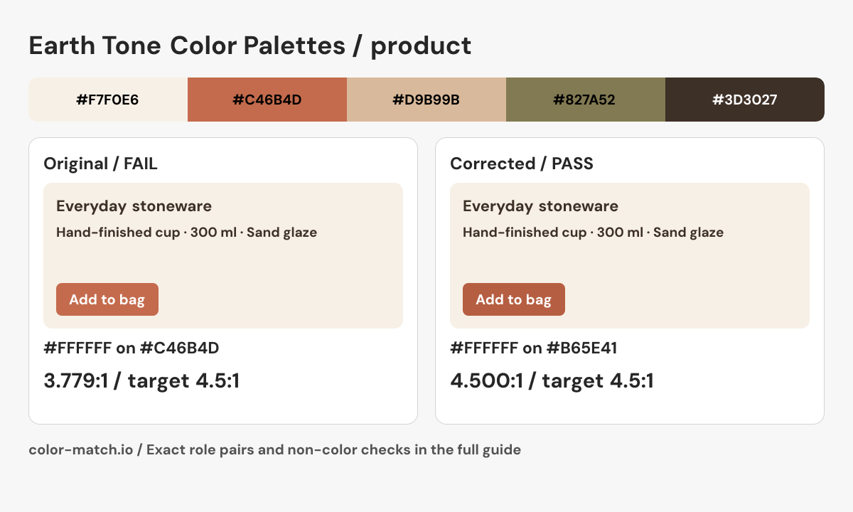
A ceramics product card uses “Terracotta and sandstone”. The original terracotta looks suitable as a button fill, but its white 16 px “Add to bag” label needs a contrast check of its own.

The original problem

White action label on terracotta: #FFFFFF on #C46B4D

3.779:1 — Fail at 4.5:1

This normal-text check is independent of the dark reading text on the sandstone surface.

Keep the white label and darken the terracotta fill to the calculated candidate below. Recheck the new fill against the card surface too. Product photography remains on the neutral surface so the action color is reserved for the next step.

Corrected pair: #FFFFFF on #B65E414.500:1, Pass at 4.5:1.

Corrected product preview

Before using this in a real interface

  • Use descriptive button text and a real button for adding an item.
  • Announce the cart update and show an error message if the action fails.
  • Do not use a red or green swatch alone to indicate stock availability.

This is a static role preview. These measurements cover the listed opaque color pairs; layout, keyboard behavior, focus, transparent layers and additional states need their own checks.

Edit the original five-color palette
Final role pairs, measured after correction
Role relationshipForeground / backgroundContrastResult
Reading text / page#3D3027 / #F7F0E611.246:1Pass at 4.5:1
Reading text / component#3D3027 / #F7F0E611.246:1Pass at 4.5:1
Action label / action fill#FFFFFF / #B65E414.500:1Pass at 4.5:1
Action fill / card surface#B65E41 / #F7F0E63.978:1Pass at 3:1

Text rows use normal-text AA at 4.5:1. Necessary control boundaries use 3:1 against the named adjacent surface. Decisions use unrounded ratios. The correction uses the same OKLCH candidate search as the contrast checker; clipping and integer RGB conversion can change the final hue or chroma.

Use the checked roles in CSS
.example {
  --surface: #F7F0E6;
  --component: #F7F0E6;
  --text: #3D3027;
  --secondary-text: #3D3027;
  --action: #B65E41;
  --action-text: #FFFFFF;
  --boundary: #3D3027;
  color: var(--text);
  background: var(--surface);
}
.example .component {
  color: var(--text);
  background: var(--component);
  border: 2px solid var(--boundary);
}
.example .secondary { color: var(--secondary-text); }
.example .action {
  color: var(--action-text);
  background: var(--action);
}

These roles include the calculated correction. Apply the selectors to your semantic HTML and complete the non-color checks above.

Earth tone product card: a terracotta action with a white label. The corrected #FFFFFF on #B65E41 pair measures 4.500:1; every final role pair is listed in the table above.
Original Color Match role diagram showing the source palette, corrected component and checked boundary or label. Download PNG.

For inline links, check the accent against both body text and the page surface. A button fill is not automatically a passing link color.

How to use this collection

  • Decide whether clay warmth or forest green should lead, then use the other family as a smaller counterpoint.
  • Keep sand and stone tones for large surfaces when darker browns carry the body text.
  • Use these HEX values for screen design. A print or paint match requires its own material and color workflow.

Color values and contrast method

Six-digit HEX codes specify opaque sRGB colors. Contrast results use WCAG relative luminance; pass or fail uses the unrounded ratio and the normal-text AA threshold of 4.5:1. A passing reading pair does not certify an entire palette or interface. Recheck transparent layers, other surfaces and component states in their actual context.

W3C: Contrast (Minimum) · W3C: CSS hexadecimal color notation · Our calculation methods

W3C: Non-text Contrast · Reproduce the contrast validation cases