Skip to content

Curated color combinations

Pastel Color Palettes with HEX Codes

A pastel color palette combines light, softened colors such as blush pink, mint, lavender and pale blue. For a website, use these shades as surfaces or decorative areas and pair them with a darker reading color. These three five-color examples keep the pastel character while giving text a clearly assigned role.

Curated by Color Match · Updated · Calculated contrast from the displayed HEX values

Blush, mint and plum

Use the near-white pink for a page surface and deep plum for body copy. Blush can fill a featured card or primary action, while mint and lavender separate supporting illustrations. This combination suits a gentle editorial layout: keep long paragraphs on the near-white surface and give the other pastels enough space to remain distinct.

Palette preview

Make room for your ideas.

Reading text uses #382B43 on a #FFF7FA surface.

Edit this palette

Reading text: #382B43 on #FFF7FA
12.501:1 — Pass normal text AA

Accent label: #000000 on #F3C9DA
14.178:1 — Pass normal text AA

The label adds black or white, whichever has higher contrast on the accent.

Sky, butter and midnight

Start with pale blue-white behind the main content and midnight blue for reading text. The sky accent can introduce a selected card, while butter yellow draws attention to a small illustration or callout. Keep yellow away from white text; its brightness is more useful as a background than as a reading color.

Palette preview

Make room for your ideas.

Reading text uses #233449 on a #F4F9FF surface.

Edit this palette

Reading text: #233449 on #F4F9FF
11.960:1 — Pass normal text AA

Accent label: #000000 on #C7DFF5
15.302:1 — Pass normal text AA

The label adds black or white, whichever has higher contrast on the accent.
Lilac, peach and aubergine

Give a portfolio or invitation layout a lilac accent, with peach used sparingly to vary the temperature. Aubergine anchors headings and paragraphs against the almost-white violet surface. The pale blue is a supporting swatch for nonessential decoration; check a fresh pair before turning any of the softer colors into text, borders or chart labels.

Palette preview

Make room for your ideas.

Reading text uses #3A2948 on a #FBF8FF surface.

Edit this palette

Reading text: #3A2948 on #FBF8FF
12.556:1 — Pass normal text AA

Accent label: #000000 on #E0D3F5
14.806:1 — Pass normal text AA

The label adds black or white, whichever has higher contrast on the accent.

Worked UI example

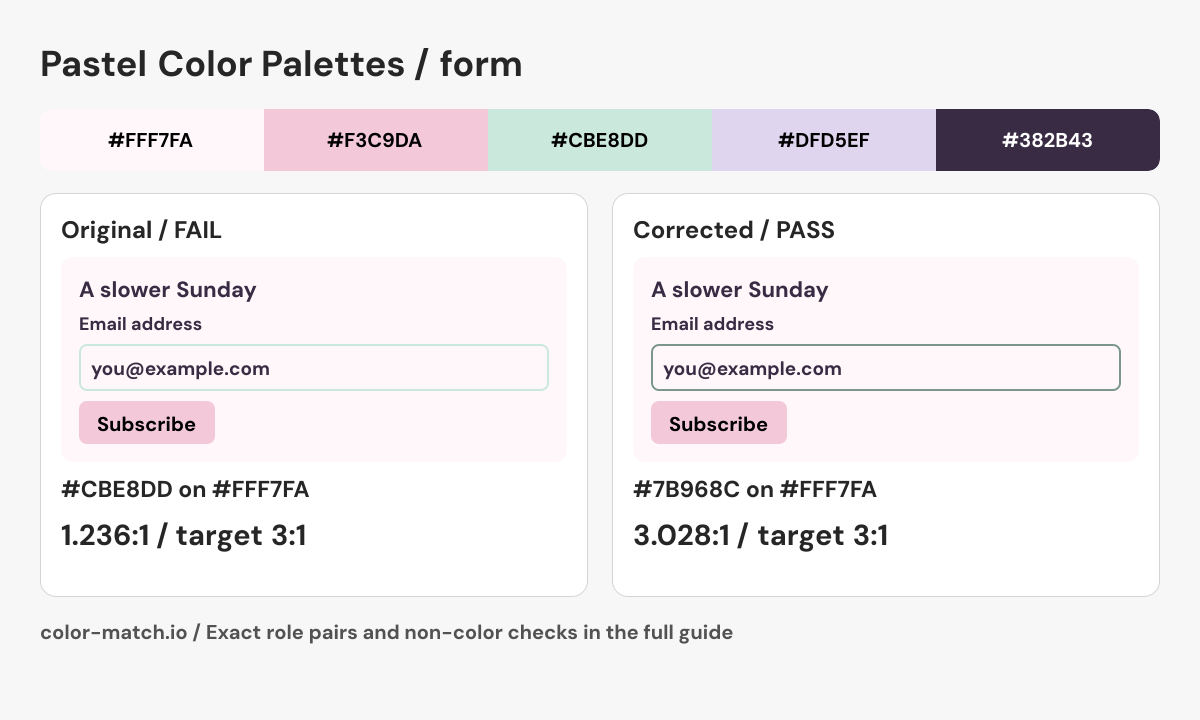
Pastel form: keep the soft fill, strengthen the field boundary

This newsletter form starts with “Blush, mint and plum”. The blush button can use a dark label, but a mint outline on the pale pink form surface is too faint when that outline is the only cue identifying the input.

The original problem

Input border against form surface: #CBE8DD on #FFF7FA

1.236:1 — Fail at 3:1

The 3:1 check applies here because this boundary identifies the field. Decorative dividers do not automatically have the same requirement.

Keep the blush action and plum text. Darken the mint border to the checked value below; the corrected border is an additional semantic color outside the original five swatches. The field uses the same surface inside and outside, so this ratio describes both adjacent sides.

Corrected pair: #7B968C on #FFF7FA3.028:1, Pass at 3:1.

Corrected form preview

Before using this in a real interface

  • Give the email field a persistent visible label; a placeholder is not a replacement.
  • Connect an invalid-email message to the field and use aria-invalid when applicable.
  • Keep a clear focus indicator and announce the subscription result in text.

This is a static role preview. These measurements cover the listed opaque color pairs; layout, keyboard behavior, focus, transparent layers and additional states need their own checks.

Edit the original five-color palette
Final role pairs, measured after correction
Role relationshipForeground / backgroundContrastResult
Reading text / page#382B43 / #FFF7FA12.501:1Pass at 4.5:1
Reading text / component#382B43 / #FFF7FA12.501:1Pass at 4.5:1
Action label / action fill#000000 / #F3C9DA14.178:1Pass at 4.5:1
Boundary / outside surface#7B968C / #FFF7FA3.028:1Pass at 3:1
Boundary / inside surface#7B968C / #FFF7FA3.028:1Pass at 3:1

Text rows use normal-text AA at 4.5:1. Necessary control boundaries use 3:1 against the named adjacent surface. Decisions use unrounded ratios. The correction uses the same OKLCH candidate search as the contrast checker; clipping and integer RGB conversion can change the final hue or chroma.

Use the checked roles in CSS
.example {
  --surface: #FFF7FA;
  --component: #FFF7FA;
  --text: #382B43;
  --secondary-text: #382B43;
  --action: #F3C9DA;
  --action-text: #000000;
  --boundary: #7B968C;
  color: var(--text);
  background: var(--surface);
}
.example .component {
  color: var(--text);
  background: var(--component);
  border: 2px solid var(--boundary);
}
.example .secondary { color: var(--secondary-text); }
.example .action {
  color: var(--action-text);
  background: var(--action);
}

These roles include the calculated correction. Apply the selectors to your semantic HTML and complete the non-color checks above.

Pastel form: keep the soft fill, strengthen the field boundary. The corrected #7B968C on #FFF7FA pair measures 3.028:1; every final role pair is listed in the table above.
Original Color Match role diagram showing the source palette, corrected component and checked boundary or label. Download PNG.

For inline links, check the accent against both body text and the page surface. A button fill is not automatically a passing link color.

How to use this collection

  • Choose one pastel for the largest area; keep the others for illustrations, section backgrounds or highlights.
  • Use the assigned dark text on the light surface. Two attractive pastels can still make an unreadable text pair.
  • When using a pale accent for a button, check both its label and the boundary against its surroundings.

Color values and contrast method

Six-digit HEX codes specify opaque sRGB colors. Contrast results use WCAG relative luminance; pass or fail uses the unrounded ratio and the normal-text AA threshold of 4.5:1. A passing reading pair does not certify an entire palette or interface. Recheck transparent layers, other surfaces and component states in their actual context.

W3C: Contrast (Minimum) · W3C: CSS hexadecimal color notation · Our calculation methods

W3C: Non-text Contrast · Reproduce the contrast validation cases