Skip to content

Curated color combinations

Neutral Color Palettes with HEX Codes

A neutral color palette centers on white, gray, black, beige or brown, often with a subtle warm or cool undertone. It still needs clear differences between surfaces, text and interactive elements. These three schemes assign those roles explicitly so you can compare a warm beige, cool gray and monochrome starting point.

Curated by Color Match · Updated · Calculated contrast from the displayed HEX values

Warm linen and espresso

Build the page on linen with espresso text, then use the medium brown for a primary action. Beige and taupe can divide generous content areas without adding a new hue. For a furniture catalog or text-led portfolio, compare these backgrounds beside the images first: warm neutrals can make cool product photos feel more pronounced.

Palette preview

Make room for your ideas.

Reading text uses #302A25 on a #F8F5EF surface.

Edit this palette

Reading text: #302A25 on #F8F5EF
13.008:1 — Pass normal text AA

Accent label: #FFFFFF on #78614F
5.799:1 — Pass normal text AA

The label adds black or white, whichever has higher contrast on the accent.

Cool mist and graphite

Mist gives tables and reading areas a light base, graphite supplies body text and slate blue-gray marks the main action. The middle grays work as supporting fills. For a documentation or dashboard layout, keep secondary labels readable instead of simply making them very pale, and check input borders as a separate pair.

Palette preview

Make room for your ideas.

Reading text uses #252D38 on a #F4F6F8 surface.

Edit this palette

Reading text: #252D38 on #F4F6F8
12.828:1 — Pass normal text AA

Accent label: #FFFFFF on #506176
6.339:1 — Pass normal text AA

The label adds black or white, whichever has higher contrast on the accent.
Paper and charcoal

Use paper for the main surface, charcoal for reading and the darker middle gray for actions. Light gray can fill a sidebar or a quiet decorative panel. This monochrome scheme keeps the focus on content, but states need more than shade changes: include labels, underlines or icons when communicating a selected option or a status.

Palette preview

Make room for your ideas.

Reading text uses #1F1F1F on a #FAFAFA surface.

Edit this palette

Reading text: #1F1F1F on #FAFAFA
15.792:1 — Pass normal text AA

Accent label: #FFFFFF on #525252
7.814:1 — Pass normal text AA

The label adds black or white, whichever has higher contrast on the accent.

Worked UI example

Neutral filters: readable secondary text without losing hierarchy

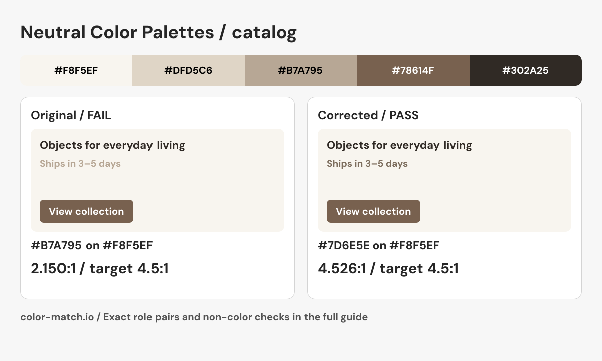
A furniture catalog uses “Warm linen and espresso”. Taupe is attractive for supporting fills, but using it as the 14 px “Ships in 3–5 days” message makes the information too faint on linen.

The original problem

Taupe secondary text on linen: #B7A795 on #F8F5EF

2.150:1 — Fail at 4.5:1

Shipping information is informative text, even when it is visually secondary.

Use the darker taupe-derived text below. Keep the original pale taupe for decorative fills and create hierarchy with type size, spacing and position. A selected catalog filter also gets a visible checkmark and text label.

Corrected pair: #7D6E5E on #F8F5EF4.526:1, Pass at 4.5:1.

Corrected catalog preview

Before using this in a real interface

  • Indicate active filters with text and a checkmark, plus the appropriate pressed or checked state.
  • Keep a visible “Clear filters” control and an understandable result count.
  • Do not communicate availability using pale versus dark gray alone.

This is a static role preview. These measurements cover the listed opaque color pairs; layout, keyboard behavior, focus, transparent layers and additional states need their own checks.

Edit the original five-color palette
Final role pairs, measured after correction
Role relationshipForeground / backgroundContrastResult
Reading text / page#302A25 / #F8F5EF13.008:1Pass at 4.5:1
Reading text / component#302A25 / #F8F5EF13.008:1Pass at 4.5:1
Action label / action fill#FFFFFF / #78614F5.799:1Pass at 4.5:1
Secondary text / page#7D6E5E / #F8F5EF4.526:1Pass at 4.5:1

Text rows use normal-text AA at 4.5:1. Necessary control boundaries use 3:1 against the named adjacent surface. Decisions use unrounded ratios. The correction uses the same OKLCH candidate search as the contrast checker; clipping and integer RGB conversion can change the final hue or chroma.

Use the checked roles in CSS
.example {
  --surface: #F8F5EF;
  --component: #F8F5EF;
  --text: #302A25;
  --secondary-text: #7D6E5E;
  --action: #78614F;
  --action-text: #FFFFFF;
  --boundary: #302A25;
  color: var(--text);
  background: var(--surface);
}
.example .component {
  color: var(--text);
  background: var(--component);
  border: 2px solid var(--boundary);
}
.example .secondary { color: var(--secondary-text); }
.example .action {
  color: var(--action-text);
  background: var(--action);
}

These roles include the calculated correction. Apply the selectors to your semantic HTML and complete the non-color checks above.

Neutral filters: readable secondary text without losing hierarchy. The corrected #7D6E5E on #F8F5EF pair measures 4.526:1; every final role pair is listed in the table above.
Original Color Match role diagram showing the source palette, corrected component and checked boundary or label. Download PNG.

For inline links, check the accent against both body text and the page surface. A button fill is not automatically a passing link color.

How to use this collection

  • Choose the warm or cool undertone beside your actual photos; surrounding colors change how a neutral appears.
  • Separate hierarchy with spacing and type as well as color. Similar grays alone may be hard to distinguish.
  • Give links an underline and give selected controls a visible shape or marker, especially in monochrome interfaces.

Color values and contrast method

Six-digit HEX codes specify opaque sRGB colors. Contrast results use WCAG relative luminance; pass or fail uses the unrounded ratio and the normal-text AA threshold of 4.5:1. A passing reading pair does not certify an entire palette or interface. Recheck transparent layers, other surfaces and component states in their actual context.

W3C: Contrast (Minimum) · W3C: CSS hexadecimal color notation · Our calculation methods

W3C: Non-text Contrast · Reproduce the contrast validation cases